Dashboard
The Dashboard section helps you understand how to use the Vela Dashboard to explore call center data easily. It shows important information like agent performance, customer trends, and more in a simple and visual way. This makes it easier for managers and analysts to make smart decisions quickly.
What the Dashboard Does
-
Quick Overview: See key data like silent time, customer feelings, agent performance, and call summaries at a glance
-
Deep Dive: Look closer at specific calls with charts and graphs to understand customer feelings, topics, and agent interactions.
-
Make It Your Own: Change the dashboard to show the data you care about most.
The Vela Dashboard turns call center data into clear insights, helping you improve operations and give better customer experiences.
Customise your dashboard
When you first log in, your dashboard will be empty. You need to set it up to show the data you want. Follow these steps to customize your dashboard.
How To Get Started - Guide
-
Go to the Dashboard Screen: Make sure you are on the "Dashboard" section of the Vela platform.
-
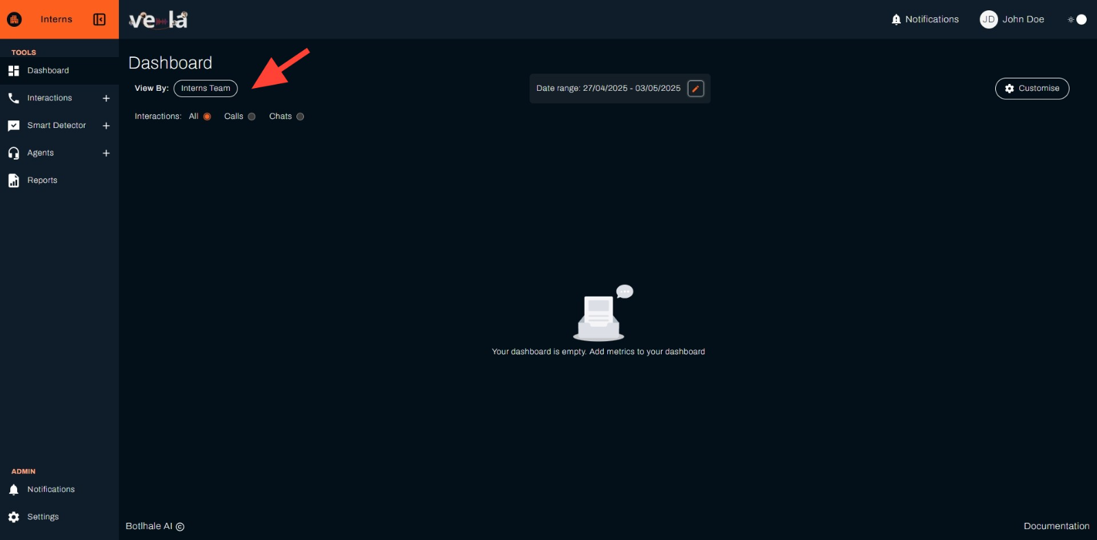
Choose a Team: Use the "View By" dropdown to select a team, like "Interns Team."
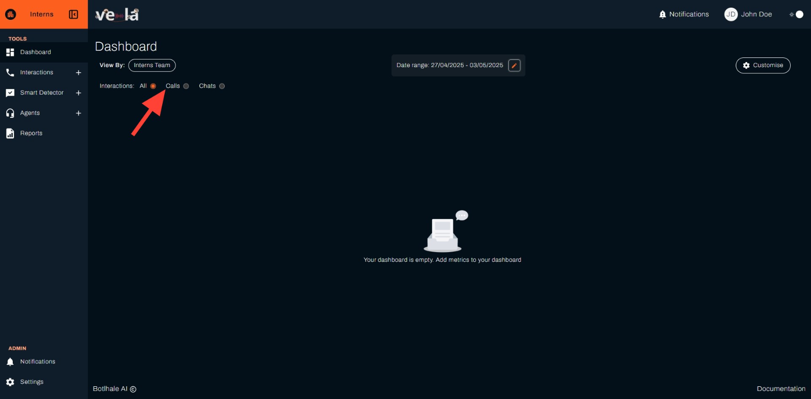
- Set Interactions Type: Pick the type of interactions to view—choose from "All," "Calls," or "Chats."
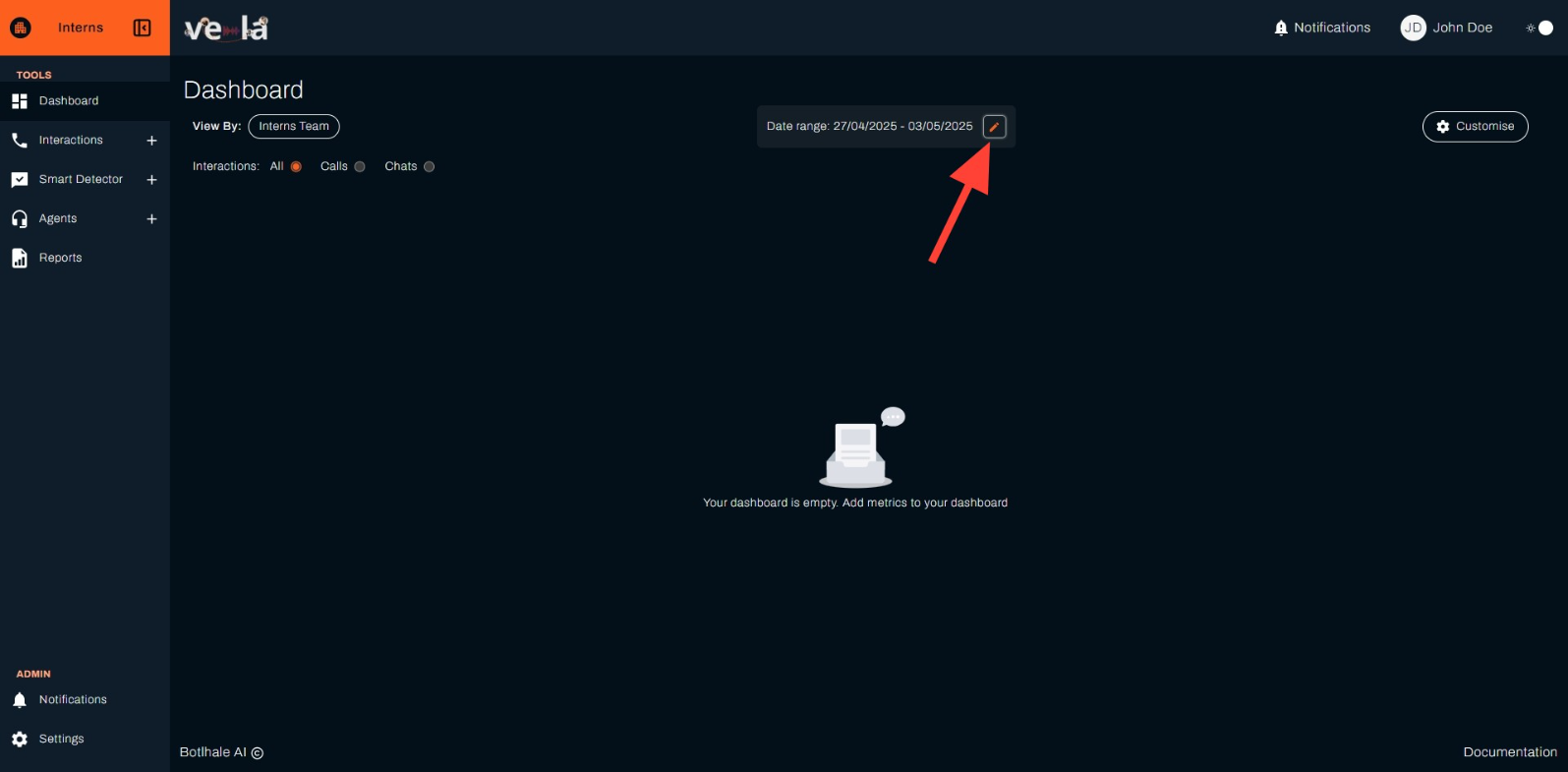
- Set Date Range:
-
Click the orange pencil on "Date range" (example: "20/04/2025 – 28/04/2025") to open the date picker.
-
In the "Select Date Range" pop-up, choose a preset option like "Today," "Yesterday," "This Week," "Last Week," "This Month," or "Last Month," or pick custom dates from the calendar (e.g., April 20 to April 26, 2025).
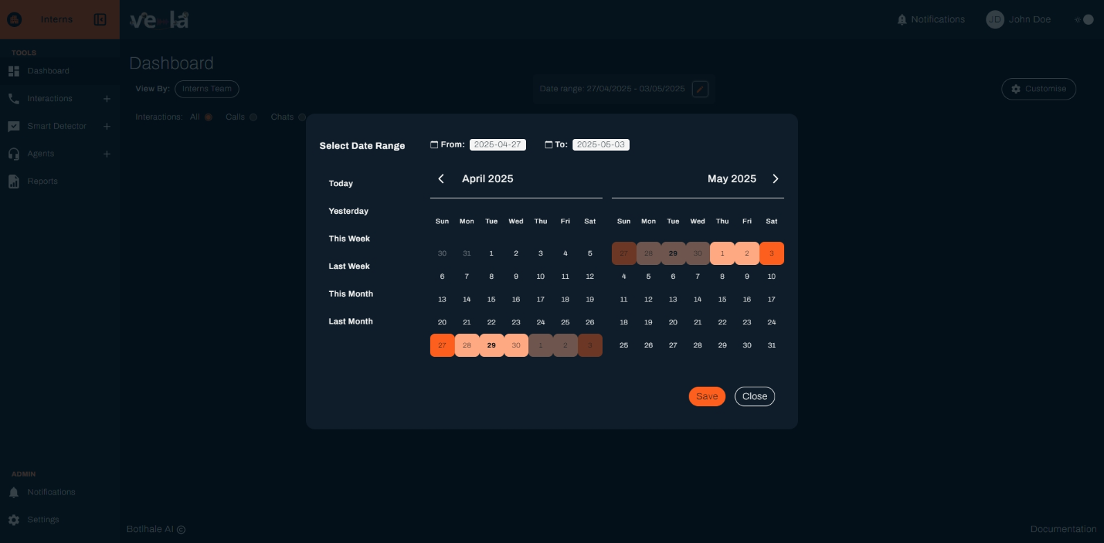
- Click "Save" in the date range pop-up.
Save Your Changes: Click the orange "Save" button in the metrics pop-up.
Your dashboard will now show the data you selected.
- Open Customization:
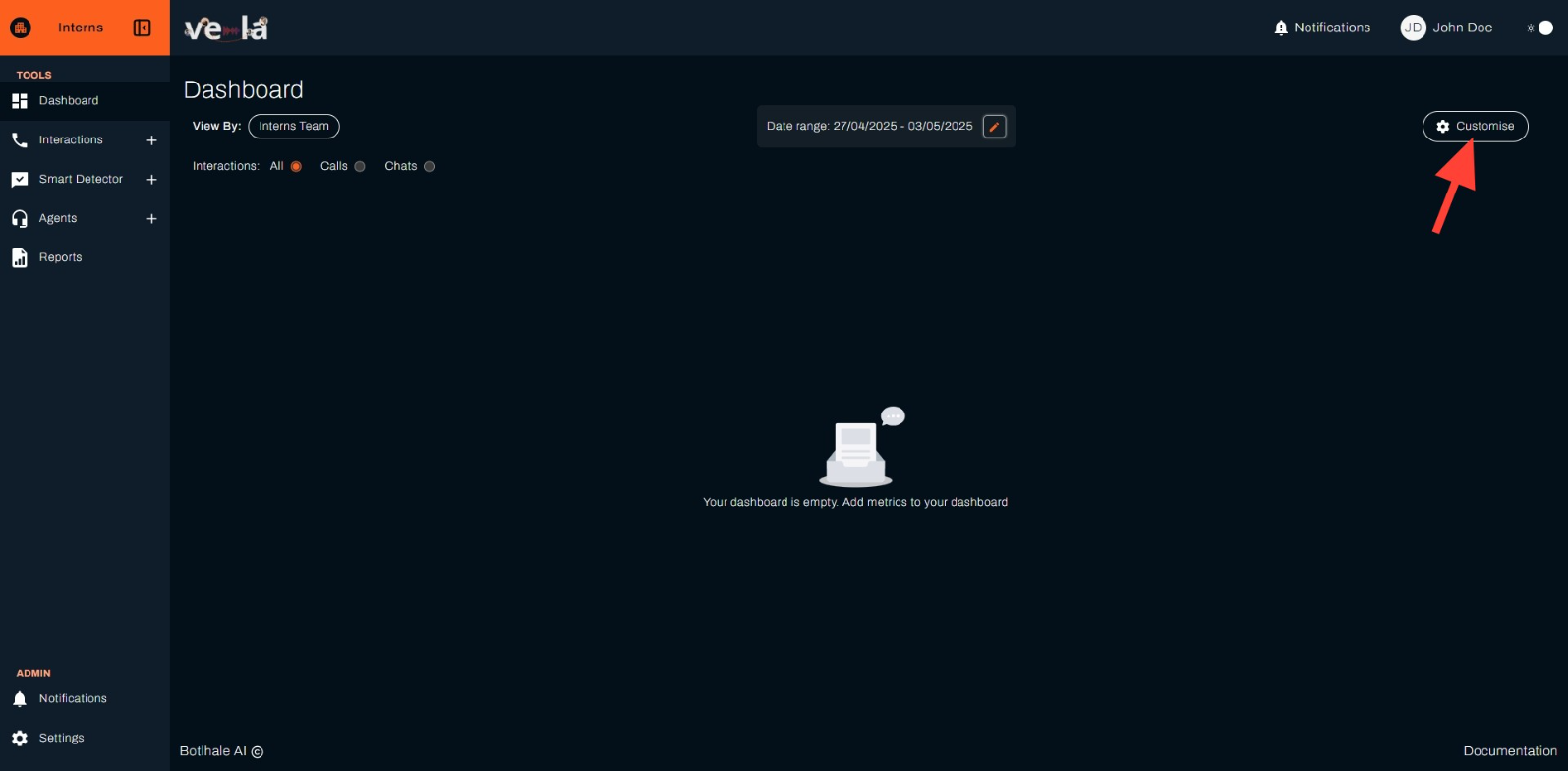
- Click the "Customize" button on the top right corner of the screen. A pop-up window will appear.
- Select Metrics:
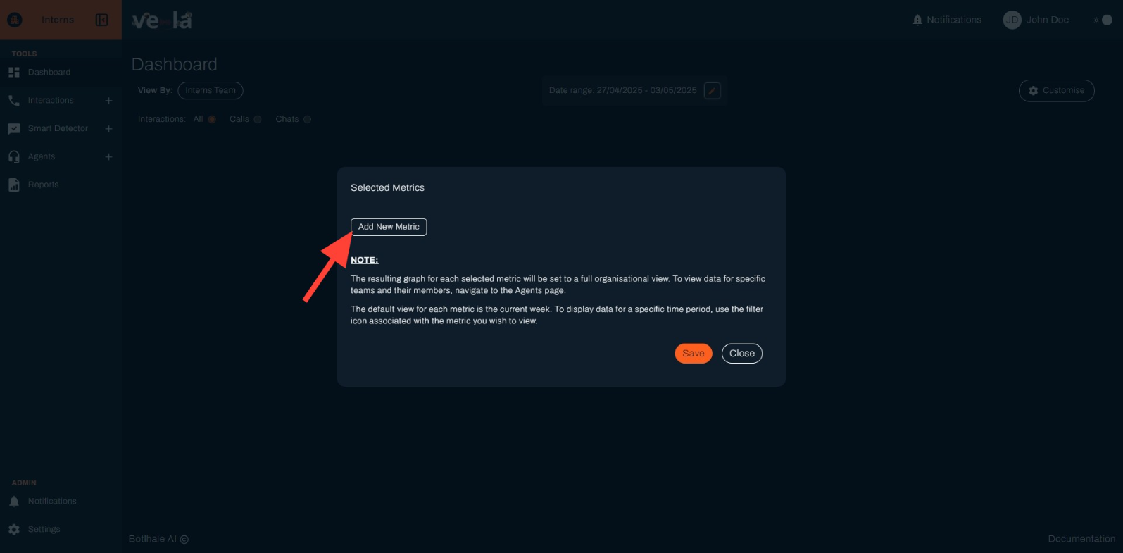
In the pop-up, click "Add New Metric" to choose the data you want to see, like:
- Agent Distribution
- Agents Scores Distribution
- Ave Call Duration
- Ave Response Time
- Average Agent Score
- Average Silent Time
- Bottom 10 Pain Points (Detected) Note: Each metric will show data for the whole organization and the team you choose. You can also filter data for a specific time period using the filter icon next to the metric.
Save Your Changes: Click the orange "Save" button
Notes
- If your organization hasn’t uploaded any call data, your dashboard will show empty cards. Check the "Data Upload" section for more details on how to add data.
- You can always go back to the "Customize" button to change the metrics, team, interaction type, or date range.